Wednesday, 4 December 2013

Design Doc- Finishing Up

    I am now coming towards the end of my design document and preparing for hand in. My documents consists of the following contents.

-Introduction to Environment
-Nature of the Scene
-Inspirational Material
-Concepts
-Areas & Functions
-Characteristic Details
-Game Engine
-Technical Process
-Sound/ In Game Example

-Bibliography
   For the introduction to the environment I briefly outlined, like I did at the start of the term the kind of environment I am trying to create and its purpose within the game. From looking at the comic book influence in GTA  and Max Payne I decided a good way to convey the nature of the scene would be in a short narrative which read:
 He was awoken by a stinging pain up his left arm. Looking to the floor he could see the glistening mosaic of broken glass, and as he began to pluck the corresponding shards that adorned his preferred beverage holder, He pondered whether there were better places to pass out then at work.
He looked around to assess the damage from the night before. The beauty of such a dilapidated environment was that you barely noticed when something else broke. As far as he could tell the pool table wasn't jammed, there were no fresh stains on the sofa, the toilets were no more disgusting than normal (although the fresh blood would indicate a fight), and the stripper pole would probably remain fastened to the ceiling for at least one more night.
   I followed this by talking about all the inspirational media I have looked at like Max Payne, GTA, Once Were Warriors etc that have influenced me on this project. I then explain what details of these games I would try to emulate in my own environment.
     I then show my concept designs and the block modeled version of the scene explaining the different areas and their interactive functions within the game. 
   I discussed how I will be using UDK, Maya and Zbrush to create this scene and then discuss the technical processes such as as lighting and textures that will affect my work throughout this project.

Saturday, 30 November 2013

Inspiration- San Andreas

   Whilst working on my design doc I thought of another game that is influential on some of the interactive elements of my environment. Once again I am looking at a game from the GTA series, this time San Andreas. Most of the helpful details come from the dating elements and the ability to have a girlfriend, that was introduced in this game.
The game introduces several elements that I want to include within the gameplay for my own scene. The ability to go on dates that isn't compulsory as part of the narrative. Also that factors outside the date, in the picture offering flowers- in my game getting drunk, could have a positive or negative outcome.
Another feature is the the measurable statistic of factors that could effect dating success. In this case we see that levels of muscle, fat and sex appeal affect character CJs luck with the ladies. When I was planning out my scene before I discussed how alcohol could be used to boost character confidence which would then affect dating success. The system in GTA seems to perfectly demonstrate how this could work.
What stuck out to me most was the disco minigame that was used to influence dating success. This seems the perfect influence as the dancefloor is one of the major interactive areas in my scene, and the area where the dating action would happen.

In my design document I discuss how whilst these interactive features will not be evident when I am simply building my scene, however they are an important factor in the whole process of planning out the design and function of the areas of my environment. Therefore I feel they are definitely details that should be included. 

Wednesday, 20 November 2013

Design Doc- Style

   Before starting to put information in my design document I needed to choose the theme design that I would use throughout it. The design doc would be an important opportunity to sell the design of the environment therefore this is just as important when it comes to making the document aesthetically pleasing. I was inspired by the heist board that appears in GTA V when they are planning a job.

   I want a similar set up in my game via a business board in the office section of the bar. As this will be the central control point of the game I decided to base my document design on this.

   Whilst the design was appropriate to the setup I had planned it the corkboard was really horrible to look at as a background. It needed to be big enough to place all the information on but this left only a small amount of the wood behind it showing. Discarding this wood and making the board full screen looked awful so I ditched it altogether and had the paper pinned to a wood clad wall which I much preferred.
 
Again this doesn't look particularly nice however with the slide information laid out on it, it perfectly describes the details I have set out for the design of my bar- rough, cheap and unpleasant.
Having decided on the design I can now lay out all the information upon it so it is aesthetically pleasing and save myself from having to adjust it all again later.

Friday, 15 November 2013

UDK Neons and Mirrors

   A particularly important design element of my scene is in the neon lighting that surrounds the strip club area. As I have already said lighting has not been a strong point in my previous works, so a specific type of lighting like neon is definitely not something I am overly familiar with. As it is such an integral part of my scene I decided this was something I should definitely research first.
   I found a very helpful site http://udn.epicgames.com/Two/ExampleMapsAdvLighting.html which among some other tutorials which may likely come in useful (particle effects etc.) detailed how to create an effective neon effect. This guide broke down the process into three fairly simple steps.

   First I need the shape of the static mesh that will function as the source of the neon lighting. This could be either strip lighting or shaped writing like below.


      This mesh would be set to the colour of the light that it is supposes to be emitting.
   Next I will need to create a projector that emits a blurred version of the shape of the mesh onto the surface upon which it is attached.

   The final stage is to set up lights of the same colour with low intensity and radius to emit the colour of the neon to anything close within the vicinity.


   Another important factor that occurred to me was that in my head I expected  the bathroom to have mirrors but I had never payed any thought as to how this effect was achieved. Whilst this is not the most important detail in my scene I considered that it would be a good thing to include if possible. I found this tutorial online that gave an easy to follow example of how to achieve this effect. http://www.youtube.com/watch?v=arOtKrvT0F4 The only complaint would be that the mirrored result was particularly low in its pixel quality. However a brief look through the comments section explained how this could be quickly altered in the settings to achieve a much more desirable result.

   After looking at some of these guides and having completed my prep work I decided it was appropriate at this point to begin working on my design document.

Sunday, 10 November 2013

UDK- Lighting

   I have used UDK previously but all that was required on this occasion was to get a working model and its relevant textures imported correctly. Therefore I have not had a huge amount of practice working with other features such as lighting. I have been looking at a useful website (worldofleveldesign.com) particularly this page: http://www.worldofleveldesign.com/categories/udk/udk-how-add-lights-dominant-directional-light-point-light.php  which goes over the basic priniciples of lighting in UDK with a video guide to help. http://www.youtube.com/watch?v=yF_xnGo8azU I will use this as a guide to prepare myself ready for BA8.
   The guide starts off by pointing out two major types of lighting commonly used. Point lighting and Dominant Directional lighting. The images below show the latter being set up for a scene.
 

     The guide then states that dominant directional lighting is generally used to depict sunlight in an environment, whereas point lights are used for light sources in interiors. As my 3D scene is a completely internal environment I guess this means that point lighting will be of greater use to me.

   Point lighting is added by right clicking and selecting the options pictured below:


   This will then add a point light to the scene. The important thing to remember is that I must consider the source of every light in the scene. Having light floating around for no reason will do nothing to make my environment look authentic. On this note I can also change the details of the lighting such as colour, intensity, diffuse rate etc. to make it as appropriate for the light source as possible.


   The guide also details the possibility to adjust the colour of shadows in a scene within the world properties. This is also essential to making the scene look realistic. Colour theory dictates that the lighting of the scene will cast shadows on the other side of the colour wheel. Warm casts cold shadows and vice versa. The picture below demonstrates a correct attempt at this.


   After setting up lighting it is possible to play test the environment to see how this lighting would look in game.


   This guide will help me when it comes to setting up my scene in UDK, I now feel much more confident about the idea of lighting my environment.

CS- More Research

     I have now received feedback on what I have written so for my Research Report. The good news is that I appear to be heading in the right direction with what I have done so far. The comparisons to fairytale in Django seems to be a strong area in which to begin my essay.
     One of my points which I have made change to since the feedback regards the flamboyant blue suit Django wears in the scene where he is whipping the slaver. I remembered reading about how this suit was featured in a famous painting "The blue boy".
Thomas Gainsborough 008.jpg
     I wanted to look at the subject of the painting as a way of exploring how further storytelling was emerging from the costumes used however research since has shown that there is mixed opinion on the identity of the character in the painting therefore I could not use it to support this argument effectively. In my feedback however we discussed the almost pantomime nature of the costume, and the fact that it is his choice to wear this garment. I am tying this in with the previous points in my essay comparing the deliberate humour of his costume choice to the extreme graphical violence.

     These types of contrasts are something I am looking at a lot in the form of Levi Straus's binary opposition. Particularly when flashback scenes are being used to contrast with the present situation.

     Whilst it is too old to have any reflection on Django, I have borrowed a book on Tarantino from the library "King Pulp".
This is useful for helping me to write my intro and plan some of the other chapters in my research report. I decided first that it was important to jot down the ideas for my other chapters so I could effectively build up to it within the intro. Most of my ideas for the other chapters have been influenced by the reading I have done when trying to find the initial direction for my essay.
      Chapter 2- Controversy
Controversy is often existent in Tarantino's work, usually due to violence or profanity. In a film like Django where huge focus is upon racial prejudice, we have the holy trinity of potentially offensive material. As such when researching the film it was easy to find many examples of complaint against these elements within the film. A strong example can be found here http://newsone.com/2150768/jamie-foxx-spike-lee/ where director Spike Lee speaks out against the film. rather than just identifying this kind of controversy I will be examining its relationship to the previous chapter and the reasons it has been included/effect it has had. I strongly suspect that, relating to the childish innocence/ extreme violence opposition uncovered in the fairytale chapter, these more "controversial" scenes make these contrasts that much more shocking to the audience- a pretty appropriate response when trying to convey the horror of the slave trade in this particular time period.

     Chapter 3- Genre Relationships
Tarantino places a huge amount of value in the history of cinema, with frequent references to previous films. In this chapter I will be dissecting other Western related media I believe may have inspired some areas of Django. Linking into chapter 2s discussion on controversy I will discuss how this was also a relevant feature within Red Dead Redemption, and how this can accompany publicity and marketing. Another important element of Django is humour. After my feedback session I was advised to look at the film blazing Saddles and compare some of the similarities between the two. Once again I will be identifying where Django may have been inspired by these other medias but also why this is important and what kind of effect it has.

     Chapter 4-Blaxploitation
Whilst my studio work and my research report don't really hold much relevance to each other, save for my film based essay and the lead inspiration game for my studio work being Max Payne, a particularly cinematic game. Howevever this is probably the only other area they cross over. Like with my cross culture examination of Afro Samurai for studio, Blaxploitation is also relevant in Django.  Tarantino has stated that he is a fan of the genre and that it has been the inspiration for previous character such as "Jules Winnfield" in Pulp fiction. My book "King Pulp" has been useful in supporting these statements within my essay. This kind of influence defininitely contributes to the aesthetics and style of a character, so for now I am looking at how making Django as "cool" or iconic a character as "Jules" or Issac Haye's "Shaft", Tarantino has created a character the audience admire and engage with. This I will argue makes his trials much more important and meaningful to us.


     I will make sure that my intro builds up to all of these in some way by mentioning Tarantino's frequent dabbling with Blaxploitation and controversy.
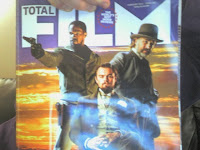
     I have also got hold of the copies of "Empire" and "Toatal Film" Magazine from when Django came out. Having given these a brief look I am not sure just how useful they will be for the completion of my first chapter on fairytale however I am sure they will come into play when it is time to complete my report in BA8
 Below are some of the references I have made use of for this stage of my essay

Boston Globe. 2009.Quentin Tarantino’s most fractured fairy tale. [ONLINE] Available at:http://www.boston.com/ae/movies/articles/2009/08/30/tarantinos_most_fractured_fairy_tale/. [Accessed 05 November 13].

IMDB. 2013.Quentin Tarantino. [ONLINE] Available at: http://www.imdb.com/name/nm0000233/?ref_=nv_sr_1. [Accessed 05 November 13].

Woods, P.A, 1996. King Pulp: The Wild World of Quentin Tarantino. 1st ed. London: Plexus Publishing.  


Friday, 8 November 2013

Blocking out

      I decided to start blocking out a very basic version of my scene within Maya so as to get a starting idea of what I can expect it to look like.
      An interesting site I came across whilst looking at some of the features of safehouses/bases in gaming was this one http://www.gamedev.net/topic/477645-safe-house-features/. It is a forum asking gamers what functions they appreciate from a safe house and this gave me some interesting ideas for things I could include like customizable music/radio options, visible mission trophies and different types of minigames. I kept this in mind as I began to block out the environment.
      This  first picture would be the bar area. I have deliberately made the drink selection limited, with only one brand of beer and a selection of spirits being available. My idea at the moment would be to have all this setup on a shelf as opposed to having any kind of refrigeration but I am not completely decided on this. In the game the player would be able to purchase drinks at the bar which would give them health, however, like they introduced in GTA 4, this would result in the character getting drunk. (http://www.youtube.com/watch?v=nBl0FBoweic demonstrated here 4.54 onwards). However I would make this continue into subsequent game missions- in GTA it was quite a short lasting effect.
     In the background (gap in the wall indicates doorway) you can see a little of the office/back room set up. From here players will be able to manage the various business ventures the character may be involved with, sleep (to fill some kind of energy/health stat or perhaps to progress the timeline), and access personal items they may have collected through the course of the game.


      These images depict the "adult entertainment" area. This basically consists of a stripper pole and two sofa areas for lap dances. I think this is a particularly important area of the bar as it spawn all the sordidness and a lot of the grimy undertone of the bar, at the same time however I find the idea of just getting a strip dance from a virtual character, like in some games, to be a little tragic. Therefore I want this to have some kind of function. For example you could buy dances for business associates to help negotiate deals, or getting a dance would give character a confidence stat boost that may make it easier/harder for him to try and chat up potential dates later. Either way I just think it is important that it performs a function within the game. I feel that lighting is a really important part of this area, especially with different kinds of lights such as neon, and I will pay much attention to this when planning this section. I will also need to focus on the range of materials and how this will affect things like reflection, the chrome stripper pole would be a prominent example of this.


      This image show the steps up to the strip area, the speakers mark the area where the dance floor will be. After looking at the site I mentioned earlier I quite like the idea that player could use this to input there own music. I am not entirely sure what the rules are on being able to feed your own music into a game like this but I am sure it is something I have seen before. The dance floor will also be an area where the character can meet dates, the success based on the characters personality/confidence can be affected by factors mentioned before like alcohol intake or receiving lap dances. You can also see the corner of the pool table in the corner, this will be one of several minigames in the bar, including card games at the tables and a dartboard.


      This picture shows the drinking area. The player could interact with customers at this point. This will be where the card games take place as well, different groups will be playing different games. On table Poker, one Blackjack etc. This would also be an area where random events such as bar fights might break out. As the owner of the bar it would be the character's responsibility to stop this and evict unruly customers.
     This final picture shows the bathroom. Further establishing the low cost and low regulation nature of the establishment it is unisex and shows evidence of the various scuffles and fights that have occurred within its 
walls.


     With these areas planned out a little I can focus on some of the technical processes that will help me build this scene. After speaking to my tutor I decided I will be using UDK. My next step now will be to look at processes such as lighting and get familiar with them before BA8. Work on this to follow